 Artists Network Membership - 1 Month
  Paint Along 119: The Art of Painting Still Lifes
  Breakthrough Paint Along: How to Paint Miniature Landscapes in Oils
  The Whimsical Face with Jane Davenport Video Download
  Breakthrough Paint Along: Essentials of Painting Portraits
  Paint Along 120: Capturing the Colors of Dusk and Dawn
  Southwest Art February/March 2025 Digital Edition
  Watercolor Artist Spring 2025 Digital Edition
  Paint Along 122: Animate Your Wildlife with Every Brushstroke
  Southwest Art December 2024/January 2025 Print Edition
  Pastel Journal Winter 2025 Print Edition
  Portraits: From Good to Great Video Download
  Experimental Pastel Techniques with Dawn Emerson Video Download
  Essentials of Painting Still Lifes
  Artists Magazine January/February 2025 Digital Edition
  Pastel Journal Winter 2025 Digital Edition
  The Best of Drawing: Strokes of Genius 16 Competition Winners Digital Edition
  Southwest Art October/November 2024 Digital Edition
  Best of Acrylic: Winners of the AcrylicWorks 11 Competition Digital Edition
  Artists Magazine 2022 Digital Collection × 1
  Pastel Journal 2022 Digital Collection × 1
  Watercolor Artist 2020 Digital Collection × 1
  Pastel Journal 2019 Annual Digital Collection × 1
  Urban Sketching: Drawing People in Places Video Workbook
  Graffiti Grunge Art by Jodi Ohl Video Workbook
  Urban Sketching: Drawing and Painting in a Travel Journal Video Workbook
  The Artist's Magazine 2013 Annual Digital Edition
 12 Tips for Fun and Freedom with Watercolor Abstraction
Explore surface, dominance, power, and freedom with advice from three watercolor artists.
Everything about watercolor that I love involves fun and freedom. It is such a pleasure to feel paint slide across my paper surface. I love how bossy the medium gets. It reminds me of myself! With watercolor, abstraction becomes the language that defines beauty, power, and chaos.
Discover three artists who know how to hone fun and freedom for their own ends. They share a few tips so you can get into the same groove. Enjoy!
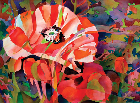
Jane Jones on How to Let Your Work Bloom
1: Combine the real and the abstract.
I drew poppies with an extra-fine Sharpie pen then added the abstract image on top with a 2B pencil. Next, I wet both sides of the paper with a natural sponge and laid it on a smooth Formica board (also called tile board), flattening out any bubbles in the surface. I left the paper untouched until the shine was off, then I used a tissue to absorb the water from the edges so I don’t get bleed-backs.
2: Start loose.
Using a 2-inch natural-hair flat, I applied the paint loosely using analogous colors of yellow-orange, orange, red-orange, red and red-violet, as well as the complement of the middle color, which is blue-green. I also used a discord on either side of the complement, skipping blue and green and using yellow-green and blue-violet. For the underpainting, I made sure not to go over a No. 3 value.
3: Play “lost and found.”
While the paper was still wet, I found the abstract shapes by painting around the forms that were losing their edges. Using the dominant red-orange color, I painted areas of the main flower, but completely covered the buds and middle-ground flower to bring the large flower forward. I pushed the background back by graying it with blue-green.
4: Create dominance.
I began integrating the background colors into the flowers, careful to leave lights in the main flower and keep the center of interest very dark against the lights. I separated each shape, abstract vs. real, with gradations of value and color. Using only pure hues, I worked wet-into-wet, layering each color; I never mixed colors on my palette. In the end, I wanted the realistic image to be dominant, and the abstract subordinate.
Carole Kauber on How to Float Images Over Reality

5: Find inspiration in sights and sounds.
This painting is based on the sights and sounds of Morocco. I based the imagery on some of the photographs I took while vacationing as well as sounds I heard there. When working abstractly, it is key to take inspiration from all your senses and push them into your painting. Sounds have a look and feel, even a specific color–use that!
6: Move from geometric to abstract.
To start I floated watercolors over a thin layer of water that defined specific geometric shapes. I then placed a geometric piece of wax paper over that colorful wet shape. The wax paper, if kept smooth, helps to define a geometric shape while adding hints of textural effects. Once that area was dry, I added new shapes and colors. Other applications of color were allowed to merge with existing shapes and forms.
7: Let yourself get out of control.
Spattering paint to several areas created an earthy textural effect. What emerged were unexpected colors and forms. It’s great to let this piece of chaos into your work.
8: Explore the unknown.
The exciting aspect of painting is the experimentation. It leads us into the unknown and forces me into new territories. Once forms have been sufficiently resolved and the desired landscape images take shape, I refer back to the photograph to add details that add to the overall image.
Marie Renfro on Getting Big and Bold

9: Use a big brush.
For abstract work, more impact comes with larger marks and overall look and feel as opposed to lots of detail. To begin this painting, I generously wet the paper with a large brush, Robert Simmons Big Daddy, and then began to apply color starting at the top right corner of the paper.
10: Add lots of color!
The most fluent way an abstract painting can speak to a viewer is through color. I did washes of pale yellow using Golden fluid acrylics Hansa Yellow Light, and decided on a cool color scheme, so I introduced some pale Ultramarine Blue and some pale washes of Phthalo Turquoise. I also laid in some small areas of Raw Sienna and Naphthol Red, as well as Alizarin Crimson. That’s a lot of color, but it works.
11: Add texture.
After the colors were dry, I get started with layering, gluing on some collage paper that I colored with acrylic colors in the same color family as the underpainting. I used a Japanese fiber paper called sekishu, which I purchase in white and then color with leftover paint in my palette. I also glued on some textured rice papers, as well as a few strips of marbleized bookmaking paper.
12: Create patterns with purpose.
My composition was to be a shapes-within-shapes format, a framed-in rectangle with dark edges around the outside and the center of focus in the lower left, leading to a secondary point in the top right. I always try to design a pattern with my light values as well as my dark values that will carry the viewer’s eye into and around the painting.
Possibilities of Abstraction
Color, contrast, line, pattern, and more! These are the possibilities of abstraction — and that is just for starters. Discover all the creative possibilities of painting abstract art. As learning artists, we can have fun with our painting while learning the techniques that will make our artistry grow in leaps and bounds.
A version of this story first appeared in Watercolor Artist magazine. To receive the magazine, click here to subscribe.


Have a technical question?
Contact UsJoin the Conversation!